Hello fellow SysOps! (and Lostpedia Users)
Goal
We need to select some of these amazing logos to become finalists. This page will remain protected to allow sysops to discuss the logos. It will remain visible to all users, but only sysops may participate in the initial selection process.
How Many?
I have a number in mind, but I'd like to hear your thoughts on how many we should select? Admin 23:15, 1 May 2006 (PDT)
- My thought would be for the sysops to list five logos they like the best and give points accordingly from 5 to 1, then add the points together and the five logos that get the most points go to the "final". --skks 00:43, 2 May 2006 (PDT)
- Good Idea, I'd also like to allow each sysop to choose 1 wildcard logo that they really like. I'd like to give the lostpedia users between 10 and 15 logos to vote on. --Admin 13:19, 2 May 2006 (PDT)
Wildcard
I want to clarify the wildcard nomination. Any logo that a SysOp picks as their wildcard is automatically put through to the final voting round. The 5 other logos you pick will be scored according to Skks' suggested method and then the 5 with the highest scores will also go to the final voting round. --Admin 22:44, 2 May 2006 (PDT)
Transparency
Just a question: That Book-Logo with the shadow - is it transparent? The shadow does not look transparent...I think it needs a white background to work. Same with the black-and-red compass logo... We should try to check them for transparency first... --aurora glacialis 13:35, 2 May 2006 (PDT)
- Black & Red compass logo is transparent (png with alpha), black book -logo is transparent (png with alpha), desaturated-yellow/rust compass logo isn't transparent at all. --skks 15:54, 2 May 2006 (PDT)
- If the sample image they uploaded isn't transparent, that's not to say they don't have an easily accessable transparent version, or would make one if they won. Are those entries automatically disqualified, or can we still admit them providing the applicant uploads a transparent one before the final 5 voting? ⇔Thunderbird⇔ 15:34, 2 May 2006 (PDT)
- There was ample time to make a transparent version, if we give someone time to retouch their logo - we should give everyone the same chance. I made my choice based on the pictures that were submitted according to the rules. I checked every logo for transparency etc, and the results are here --skks 15:39, 2 May 2006 (PDT)
- I say: Revision upon request. I voted for the book and find no pain in turning it into transparent upon request. If I found a disqualified entry that totally blew my minds that would be the logical thing to do. †††GodEmperorOfHell††† --18:35, 2 May 2006 (PDT)
- You don't have to do anything to the "black book" -logo, it already has all the transparency it needs. :) --skks 18:45, 2 May 2006 (PDT)
- Some people may need assistance converting to the correct transparency. If that is the case, I'm sure we could work with the artist to get it corrected. As long as it looks content doesn't change, I don't have a problem with modifying the format for transparency requirements.
Jabberwock talk contribs email - 20:26, 2 May 2006 (PDT)
- Some people may need assistance converting to the correct transparency. If that is the case, I'm sure we could work with the artist to get it corrected. As long as it looks content doesn't change, I don't have a problem with modifying the format for transparency requirements.
- Let's use our best judgement. Some of the logos are square, and actually work without the transparent background. Other logos might have a white background, but could easily be modified to work with our theme. Let's give the artists the benefit of the doubt. I don't think the transparent background issue should eliminate an otherwise amazing logo. Admin 22:44, 2 May 2006 (PDT)
Nominations
My top-5, left to right, * is the wilcard:
*:  5:
5:  4:
4:  3:
3:  2:
2:  1:
1: 
--skks 00:43, 2 May 2006 (PDT)
My top-5
WC:  5:
5:  4:
4:  3:
3: 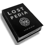 2:
2:  1:
1:  †††GodEmperorOfHell††† --04:30, 2 May 2006 (PDT)
Wow, so many to choose...
5:  4:
4:  3:
3:  2: http://kinkajou.ois.uri.edu/~cvr/lost-maincarl2.png
1:
--Circeus 06:47, 2 May 2006 (PDT)
I tried to choose logos that would have longevity, not based on current show focuses (Namely the numbers).
5:  4:
4:  3: http://kinkajou.ois.uri.edu/~cvr/lost-maincarl2.png
2:
  1:
1: 
⇔Thunderbird⇔ 08:50, 2 May 2006 (PDT)
I think the numbers will stay with us for a while. But Swan logo etc may not be the focus much longer.
5:  4:
4:  3: http://lostpedia.com/images/6/6a/Logo_mark_2000_1.png
2: http://kinkajou.ois.uri.edu/~cvr/lost-maincarl2.png
1:
--aurora glacialis 13:35, 2 May 2006 (PDT)
Lots of great logos. W=wildcard.
W:  5:
5:  4:
4:  3:
3:  2:
2:  1:
1: 
--<<Novajoe23>> 17:49, 2 May 2006 (PDT)
Great work everyone on the contest! Here are my nominations:
Wildcard:  5:
5:  4:
4: 
3:  2:
2:  1:
1: 
Jabberwock talk contribs email - 20:26, 2 May 2006 (PDT)
There are some fantastic logos this time around. The only reason I've chose my wildcard that I have is because my first choice (My Number 5) is already wildcarded, so will be in the final anyway! Here are the ones I nominate
Wildcard: 
5: 
4: 
3: 
2: http://st00pidly.googlepages.com/logo_tanto.png/logo_tanto-full.png
1: 
--Plkrtn 05:02, 3 May 2006 (PDT)
