the I Ching
Idea - Is anyone else reminded of the I Ching [1] when they see these logos? They remind me of I Ching trigrams.
Update: the Lost and I Ching wikipedia entries mention this, but I didn't see anything here about it.
- I added a bit about this to the general section, since the patterns around the logo line up perfectly with the trigrams of the i ching, including compass directions with north at the bottom and then proceeding around in their "proper" order. Jon the Geek 22:12, 6 April 2006 (PDT)
Vote for "insignia"
I agree that the word "Logo" may not be appropriate.
I prefer insignia.
The six logos have surfaced
I uploaded them as station1.jpg to station6.jpg. could someone savvy in i-ching start decoding them? I see no resemblance of any of the six to the shark's --GodEmperorOfHell 19:30, 5 January 2006 (PST)
Take Note
The other logos might be forgeries as they don't follow certain paradigms in the other one, and someone who works on the show (forget who) went on record saying that the video they come from was not from a show related source.
That said, I think the shark logo is rotated 3 notches counter-clockwise from the others. As if you do that the lines start to match up. The lines on the outside of the Swan and Arrow Logos match identically (excepting their outermost ring). --Circeus 21:21, 5 January 2006 (PST)
Feng Shui
Has no-one noticed that the logo is a Feng Shui mirror with the animal where the mirror should be?
logo
my mate showed me a website which talked about some sort of chi ritual thing andit had the near exact same logo as the station logos. perhaps the station logos are a mix between i ching and the thing i found. im sorry i cant post the website, ive forgotten it, but when i remember ill post it for comparison
New Logo in the Mega Lotto Jackpot site?
I was just on "MegaLottoJackpot"[[2]] and saw a new logo in the lower left corner. I can't make what's inside the octogon. The file name (when I right click, save as) is "catbirddharma.gif"
It's called catbirddharma.gif and it looks like a cat catching a bird. Wierd --Jambalaya 14:12, 13 February 2006 (PST)
The additional logos
Jabrwocky7: AFAIK, those logos are hoax. Just look at the titles; "Station 5" is repeated twice.. --Jambalaya 14:06, 16 February 2006 (PST)
CatBird logo on megalottojackpot.com
- I believe this is another hoax website and logo. According to the whois, megalottojackpot.com is registered to an individual in Gaithersburg, MD, not ABC/Walt Disney. An article by CNET News says this is just a well-disguised fansite. --Jabrwocky7 15:21, 20 February 2006 (PST)
- Originally posted by unregistered user at 83.70.178.165
- This logo appears at the bottom of the Mega Lotto Jackpot website.
- It is called Cat Bird.
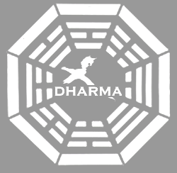
- The text "DHARMA" appears through the center of the logo.
The logos from the dubious 'second orientation' movie
Someone should add a reference to these, clearly stating that their origin is undetermined, simply to avoid confusion. Godkveld 08:05, 22 February 2006 (PST)
I think we should only include logos that actually appear in the show. The CatBird logo was deemed as fan-created and (re)moved from this article. Your point is a valid one, but maybe we should keep this article for genuine logos. Any thoughts on making this a "policy" for the article? --Jambalaya 16:39, 20 February 2006 (PST)
Okay, perhaps an article for 'unconfirmed/unofficial logos' then. It's probably possible to come up with a better name than that, though. :p Godkveld 08:05, 22 February 2006 (PST)
Giving the logo a name
Ok, I hope that I don't jump to any conclusions, but seems very plausible at this point that this logo fits in the Apollo constellations (being Orion's belt). The logo has now appeared not only on the shark, but also on the canteen, which _might_ indicate that the logo isn't a practical joke from the CGI guys after all... Shoot me if it turns out I'm wrong, but I think we could call this unknown logo "Orion's Belt"? --Jambalaya 17:57, 3 March 2006 (PST)
I don't know. it is not a fact though. The arrow was definitely an arrow, but this is just a line... could be a general simplified dharma logo or anything. I'll put it in ""... --aurora glacialis 03:06, 4 March 2006 (PST)
The Outline
Something I noticed, the continuous outlines all seem to be where it's white on black and the broken ones are vice versa. --Tricksterson 10:10, 9 March 2006 (PST)
Logo or Emblem =
Could the swan logo really be a scorpion's stinger?
Could the design on the shark have been placed using a branding iron?... a possible explanation why the design is not as "crisp" as the designs seen elsewhere...
Maybe consider using another term to describe these designs...
1. The word "logo" carries a commercial, advertising, or marketing connotation.
2. Could be confused with a concept from Christianity... "logos" is Greek for "word"-- "In the beginning was the word...", "The word was made flesh..." In a course on religious studies, esp. Christian theology, "the logos" would be a phrase frequently used by the lecturer.
3. "Emblem" may be a better word as the Dharma Initiative is an academic/research endeavor.
--BrianSTL 10:15, 23 November 2005 (PST)
I disagree; 'logo' as in 'corporate logo'. It won't be confused with a concept of christianity because this is not a course of religious studies. --GodEmperorOfHell 20:12, 27 November 2005 (PST)
But philosophic and religious themes and inferences can be detected throughout the series to date.
--BrianSTL 11:15, 29 November 2005 (PST)
Maybe reagrding that, a religious connotation is not so bad ;-) - but I agree, that the Logo is a Corporate logo. It even looks a lot like a commercial Logo. The way it appears on so many items, lets one think about commercial Logos or Brands. --aurora glacialis 08:30, 11 March 2006 (PST)
I actually kinda agree with the poster at the top - Dharma Insignia sounds best. --Jmast7 23:15, 6 April 2006 (PDT)
Source?
-It has been reported, that in reruns of the show, this logo was removed from the shark in the according episode, possibly it had no significance for the show. It could be that it was just a practical joke of the film team or that it was done wrong, which would account for the difference to the logo on the canteen.
-The producers have said the effects team put it there without the producers approval, causing it to be removed from future airings. This coincides with the different appearance of the logos in this section.
can someone give a source for this statements? --Cool Man 0912 09:50, 29 March 2006 (PST)
Theory about "Orion" Logo
Moved from article page. Arguments over theories that have not been debunked in the show should take place on the talk page
This logo is almost certainly purely imagination. The canteen has red behind the white bar, which would fit with the Staff, where Ethan was working, and the Shark reportedly only had a logo as a staff joke. --User:Jon the Geek 19:32, 6 April 2006 (PST)
Hm, we could remove this Orion's belt-thing then.. Anyone got a capture of the canteen in a higher quality? --Jambalaya 03:33, 7 April 2006 (PDT)
Why are we moving the belt? We have seen it twice. Even if the shark thing is a hoax-no body has any evidence that it is a hoax-we saw it on the canteen. That confirms the logo, maybe not a station, but the logo yes.--Meterman 9:27, 18 May 2006 (PST)
The Canteen Logo cannot be the Staff - Note the outline: The Staff has gaps in the Outline, the Canteen Logo's outline has no gaps. Sorry ;-) --aurora glacialis 07:30, 10 April 2006 (PDT)
- Neither do the other things in the medical hatch, such as the vial. Sorry ;-) Jon the Geek 14:20, 12 April 2006 (PDT)
True, the logo from Ethan's canteen is the logo of the Staff, the line in the middle is basically the "Dharma" writing, and there is definitely a red symbol there, which has to be the same as on the Staff logo since Ethan worked there. So it's more likely he would take a canteen to drink water from the station he was staying. If the Orion's belt logo would be real, why doesn't it have the Dharma writing like the other 3 logos (Swan, Arrow, Staff)? --Skyshadow 02:43, 28 April 2006 (PDT)
- I made the enhanced version of the Ethan's canteen logo. All I did was make what is white in the logo highly visible, and I also partially corrected the perspective. But looking at it again, it's difficult to tell if there might be a slightly darker verticle line (the staff), or if this is just due to lighting. It does not seem possible to me that the horizontal line could be text reading "Dharma" as it seems quite clear that it is no more than a line. But to be honest, I can't be positive from the image provided, it's just not clear enough. Here's a second stab at it, this time in color with no changes in contrast, only perspective and sharpness:
- http://www.lostpedia.com/wiki/Image:Canteen2.jpg
- I didn't add it to the page because I agree it's a mess with so many images and I didn't want to make things worse.
- Smeagol 14:32, 5 May 2006 (PDT)
All of the logos
Is it nesseccary to have 3 or 4 different pictures of the logo? I can see having two, 1 taken from the show and another enhanced or somthing but all of the pictures make this page look really bad. Koolaidman 05:18, 29 April 2006 (PDT)
Can someone fix the logos?? --user:Nusentinsaino 20:49, 10 May 2006 (EST)
Comic Sans
Has anyone else noticed the Arrow logo uses Comic Sans... what kind of cheesy psychological experiment is that? --Corrosionx 21:58, 10 May 2006 (PDT)
You're wrong. Nusentinsaino talk contribs email
No, they're not. I doubt it's being used in the show, but the logo image we've got up on this page does use comic sans.
Non Hatch Logos
Suggestion: creation of a new article listing all known logos created for the show and its promotion by ABC. This would include the hatch logos, but also logos for Widmore labs, Oceanic Air Apollo Candy bars, Hanso Foundation logos, and the various project logos from thehansofoundation.org page, and many more. Basically it would be a tribute whoever is doing graphic design over at Lost. Not sure what we'd call the article, maybe just List of logos. Santa 13:13, 12 May 2006 (PDT)
The Door & Orion's Belt
The Door logo should be moved into the 'Confirmed' section of the page, and be added to the group at the top. Similarly, the Orion's Belt logo should be moved down into the 'Unconfirmed' section, and be removed from the group at the top. --Doc halidai 07:47, 18 May 2006 (PDT)
I went ahead and moved the entry for "The Door", but left "Orion's Belt" in place. I think it should be "demoted", but I'll leave it to someone else to make the decision. --Doc halidai 08:07, 18 May 2006 (PDT)
On the aircraft
Moved this section to the persistant rumours page.
door logo
The door logo is wrong - the real logo has openings around the outer edge (http://photos1.blogger.com/blogger/4708/2679/1600/dharmalogonew.jpg) --Ernest 09:18, 18 May 2006 (PDT)
That's because it was spraypainted, all the logos have openings when appearing on walls. --Peephole 09:35, 18 May 2006 (PDT)
- I'll be damned. --Ernest 13:16, 18 May 2006 (PDT)
lol use your damn common sense. :) Nusentinsaino talk contribs email
The spraypainted door on swan station don't have the openings. --Techiedavid 20:26, 21 May 2006 (PDT)
Interpretation
Can someone explain the compass points and good and bad parts? Or should we remove those?
- I've removed it because it was overwhelming the article. This is Lostpedia, not Ancient Chinese symbol-pedia ;) -- LOSTonthisdarnisland 08:53, 21 May 2006 (PDT)
"The Infinite"
I'm removing this entry because it is completely a fanmade logo with no relevance/connection to the show (unlike the Flame which at least is based on an in-show reference and "Orion's Belt" which has appeared in-show, though is disputed). Anyone care to comment or argue against my change?--Isotope23 15:06, 22 May 2006 (PDT)